Food delivery app
Results
- Thanks to the discovery phase we were able to identify users' expectations that were previously overlooked and write detailed user stories for various scenarios.
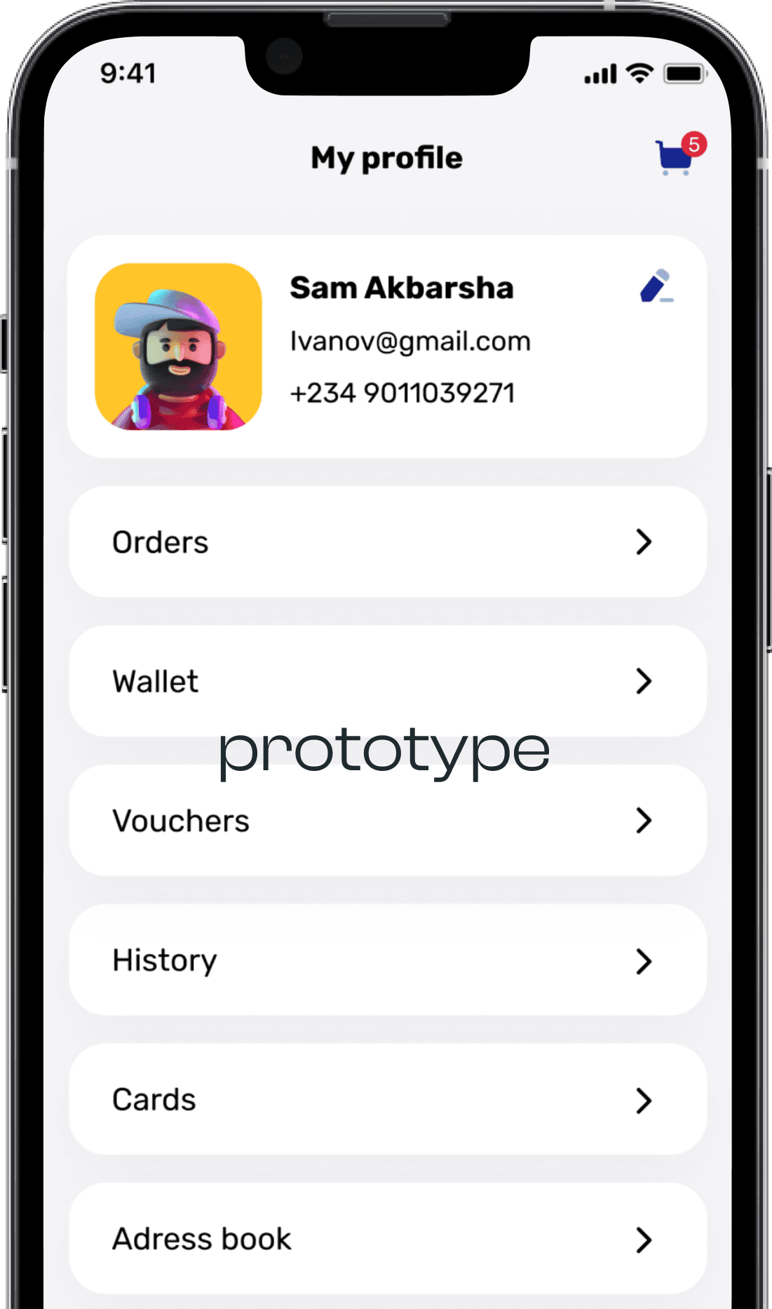
- Created a new dynamic design concept that includes market trends and best practices.
- Improved user experience: faster and enhanced search process, easier order management, and checkout.

About the project
The client already had a functioning food and grocery delivery app. The app had all the standard food delivery app features such as search bar with filters, restaurants and menus, cart management, check out, payments, and delivery tracking. What’s more, this food delivery app had social media functionality to let users share their experiences about the food and places.
The goals
The client came to us to improve their client-facing mobile app in terms of design and user experience. The interface of their app did not meet user expectations, it was inconvenient and had troubles with navigation. Because of this, the client was losing potential customers and revenue.
Thus, they were looking to revamp the app to attract new users and increase profit. This food delivery app should become an easy and comfortable tool for meal and grocery ordering.
SolveIt’s Mission
Our main task was to identify the challenges users faced when using the application and analyze competitors to create a concept of a brand new interface design. It should meet the goals of the client's business by bringing more users and revenue.
- Perform a thorough discovery phase.
- Create a new engaging and attractive interface.
- Work through all the objects and screens according to the user stories.
- Restructure the screens to improve usability and increase engagement.


Discovery phase
Discovery package:
Duration:
1 month
Features

Looking to launch
a successful product?
