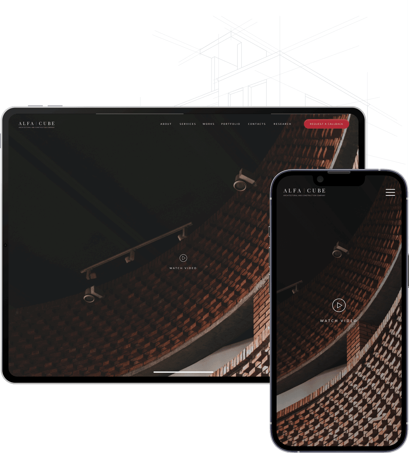
Website for a construction firm

About the project
The architectural and construction company "Alfa-cube" wanted to create a corporate website from scratch. They were looking for a software company that could also do the construction website design. It was important for the customer not only to develop a website, but also to develop a unique identity for Alfa-cube.
Client tasks
- Project management;
- UX/UI design;
- Web hosting;
- Website frontend development.

The main goal
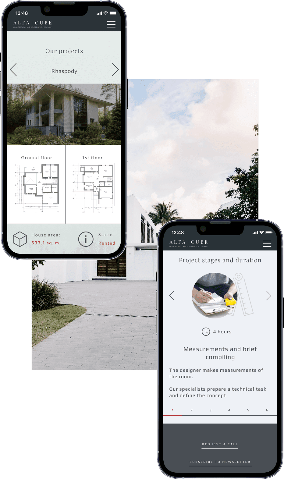
Architecture and construction is a complex area with many stages in the sales funnel. It was important to give potential clients a clear explanation of all stages of work and the subtleties of the construction process.
Therefore, the development of a corporate website for construction company presupposed a well-thought-out interface design with an emphasis on the correct structure of information and the most understandable user interface.
The challenge
Systematization and delivery of information
Explain to the client all the stages and subtleties of construction as simple as possible, to make reading as simple as possible.
User Interface Design
It was necessary not only to convey the chosen style of Alpha Cube, but also to create a concept that would be relevant for many years. As a basis, it was decided to choose not catchy colors as the main ones, but use a corporate color as an accent for a call to action and to emphasize important information.
Graphics Optimization
The client had a large portfolio, which was represented by a large number of photos and high quality renders. It was important to post a photo on the site with the least loss of quality, but not to annoy users by waiting for a few minutes to upload a photo. For this, the designer did a lot of work to optimize all the photos.
Responsive Web Design
More than half of users come to the website from mobile devices, so particular attention was paid to the website development for mobile devices.
Results
The SolveIt team collected the needs and wishes of the client, conducted an analysis of the target audience and competitors, more suitable technologies. After that, the analyst wrote the specification.
After agreeing on the terms of reference, our UX / UI designer started developing the site design. Our designer did not use the most striking trends that will soon lose their relevance. We focused on making the site look neat and clean, with the right accents and eye-catching color combinations.
After developing and agreeing on the design, we proceeded to web development. There were some complex technical solutions on the site, for example, a horizontal scrolling, with the help of which the scheme of building a house with time intervals is shown in a very detailed way.